(Last updated December 5, 2025)
Co-authored by Jill Queenan, Communications Strategist
You’ve got your company or product name, you’ve established a strong brand identity and you have a solid strategy messaging platform in place. But the fun’s not over! Now it’s time to establish a visual system that reinforces your brand strategy in a distinct and cohesive way.
It’s not just about creating a logo. Your brand’s visual system comprises numerous elements that work in concert to tell your story, providing both the flexibility and constraint required as your company evolves.
While every organization is different, a typical visual brand identity may include a logo; supporting graphics; typography; a color palette; iconography; motion and interactive elements; photography and/or illustration style; data visualization standards; and web design guidance.
Since it’s true that a picture says a thousand words, here’s a look at five visual brand systems we love.
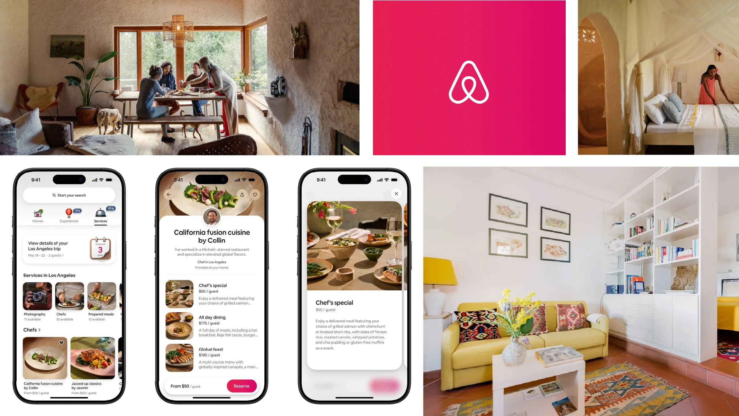
Airbnb
With more than 2 billion guest arrivals and counting, Airbnb has changed the way people travel. The company’s brand is centered on belonging, and its visual identity reflects this with engaging typography, authentic photos, a warm color palette, and its curved “Bélo” symbol as a strong emotional anchor. This year, the brand unveiled a reimagined visual system that reflects its evolving offerings. It brings new dimension and animation to the Airbnb experience and supports the company’s broader ambition of being a full-featured travel and services ecosystem.
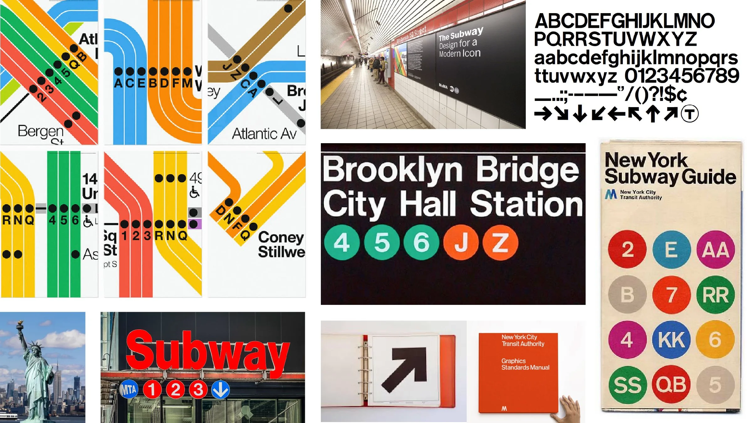
NY Transit Authority
New York City’s iconic subway maps guide more than 3 million travelers each day. But navigating the Big Apple hasn’t always been so easy. Until the mid-1960s, the NYC transit system consisted of confusing signage and inconsistent design, making it difficult for riders to get from here to there. Graphic designer Massimo Vignelli took on the formidable task of demystifying this navigation nightmare and establishing a new intuitive visual system. The result is history—a bright, diagrammatic aesthetic and incredible UX design (before UX design even existed!). A half century later in 2025, New York’s subway map got a modern makeover, yet that quintessential New York look lives on.
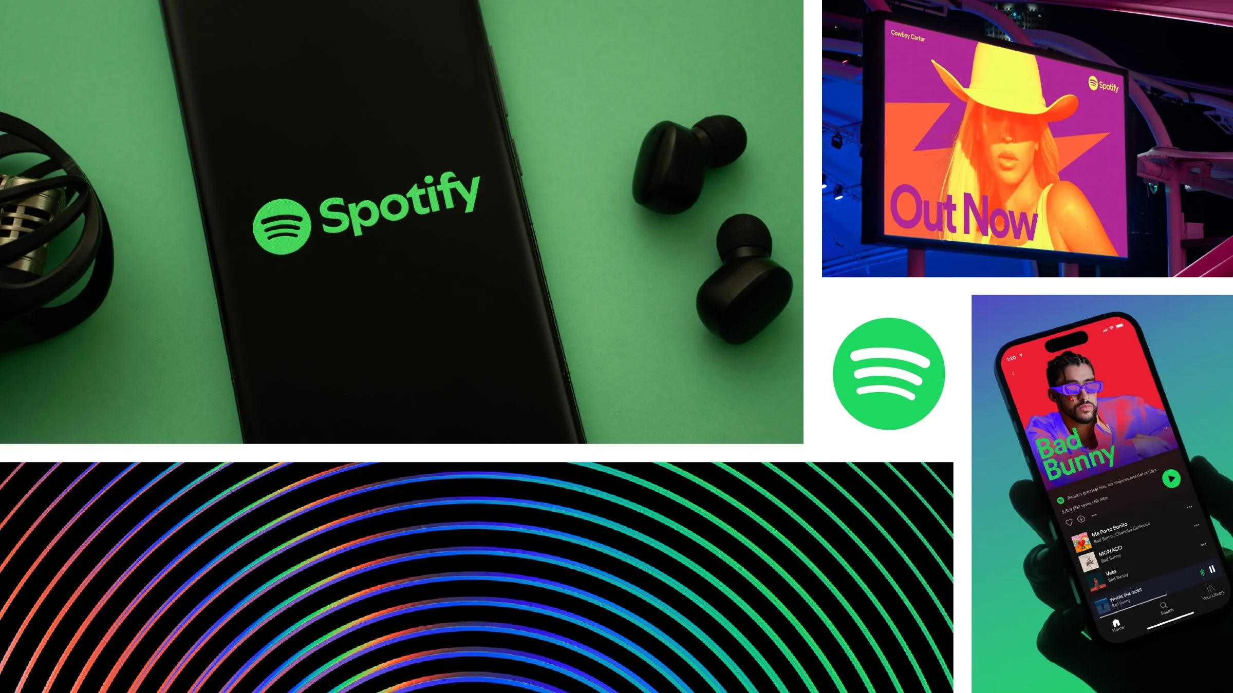
Spotify
Spotify’s vibrant, modern aesthetic is instantly recognizable to music lovers everywhere. The brand employs high-contrast color combinations and expressive gradients, creating a dynamic feel that reflects the energy and diversity of the audio content on its platform. Minimalist typography keeps the design approachable, while playful motion graphics and waveform-inspired elements reinforce Spotify’s connection to sound. This cohesive yet flexible visual system allows Spotify to stay fresh while remaining unmistakably itself.
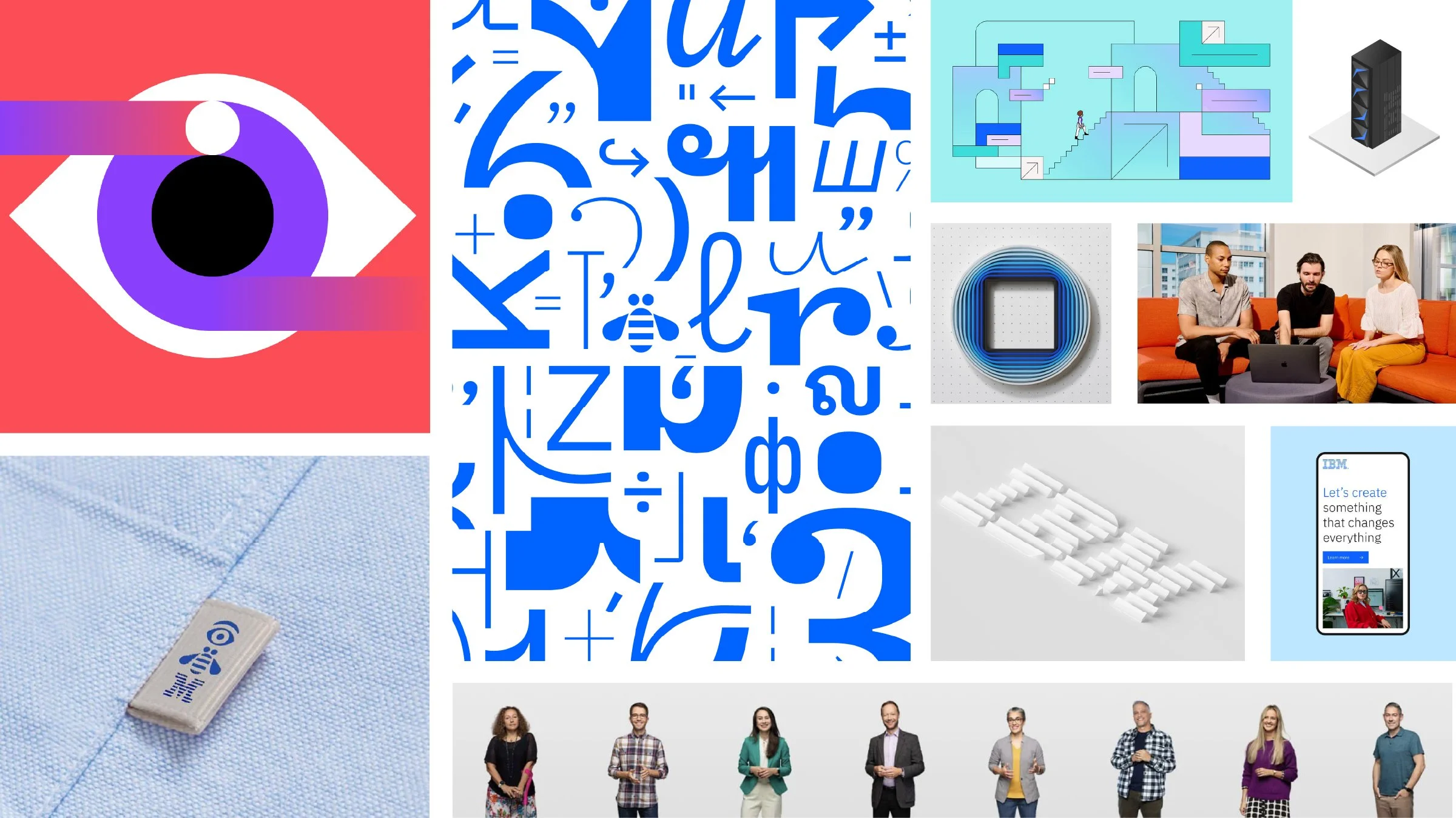
IBM
“Build Bonds.” This is the guiding ethos behind IBM’s design philosophy and principles, helping the company distinguish every element and every experience. From bold hues and brilliant geometric patterns to expressive motion that captures users’ attention, the technology giant’s visual language is a striking blend of human-centered design practices and time-tested business acumen. Famed American architect and IBM industrial designer Eliot Noyes once said, “A corporation should be like a painting; everything visible should contribute to the correct total statement.” IBM’s visual identity does just that.
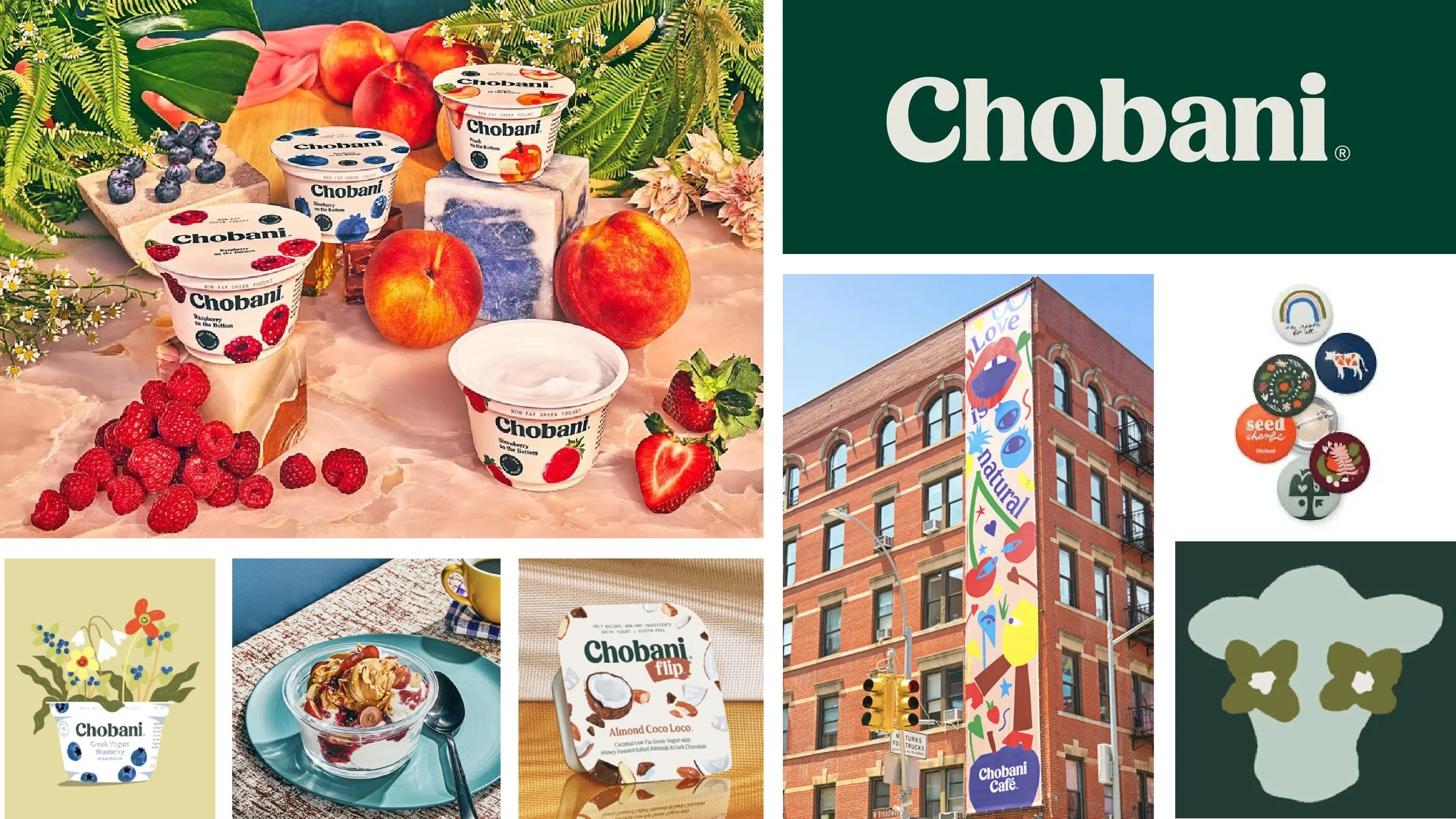
Chobani
The company that made Greek yogurt mainstream unveiled a new visual system timed with its 10-year anniversary. From competitive analyses, consumer perception studies and an exhaustive distillation of the brand’s heritage and values, Chobani found that while they make yogurt, their real business is in universal wellness—from nutritional wellness to social wellness to environmental wellness. The company successfully translated this notion into a wholesome, highly distinctive visual system that conveys these key design values:
Be handcrafted
Be approachable
Have a sense of naivety
Have a sense of nostalgia
This system shapes everything from the brand’s packaging, website and campaigns to its cafés, and more. And now…we’re hungry.
What makes a strong visual system?
Strong visual systems share these five traits:
Strategic: They are not just aesthetic. They’re directly tied to the brand’s mission and value proposition.
Distinctive: They are easily recognizable—even if you remove the logo.
Consistent: They look the same across digital, physical and global touchpoints.
Flexible: They can scale from icons to billboards without losing clarity.
Emotional: They communicate a feeling or worldview (e.g., Airbnb = belonging or Nike = empowerment).
A visual identity done right will encapsulate your mission, reinforce and extend your brand message, unify your communications efforts and help build brand loyalty. Ready to take your brand identity to the next level with a new visual system? Take 10 minutes on us and discover what’s possible.